
Restaurant Menu Typography Guide
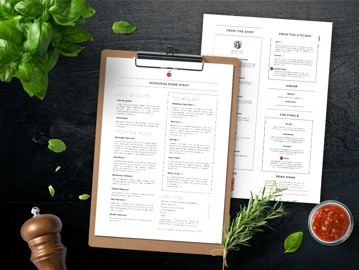
Typography is one of the most important elements of professional restaurant menu design. The right fonts can communicate your restaurant’s personality while making food names, descriptions, and prices easy for customers to read.
A luxury restaurant may benefit from elegant typography, while a modern café or casual restaurant may work better with clean and contemporary fonts. However, attractive typography should never come at the cost of readability.
Font size, weight, spacing, alignment, hierarchy, and the combination of different typefaces all contribute to the final look of a menu. Using too many fonts or creating poor contrast can make even a beautiful menu difficult to navigate.
In this article, we’ll cover how to select restaurant menu fonts, create a clear visual hierarchy, combine typefaces effectively, and use typography to build a menu that feels both stylish and functional.
recent projects
Check Our Latest Cases
We always try to implement our creative ideas at the highest level. You can see it by looking at our portfolio.
View All

about us
We are the Creative Digital Teams.
Our digital company has been developing products for 10 years.
We’ve got a lot of awards for our work and Graphic Design that have become popular in the world. We try not to miss important details in each area.